Situated in Xiaoshan District, Hangzhou, designed by Tri-Orange Design the project is a new type of socializing and retail center and leisure venue for young people, which injects new vitality and value into old architecture in the context of urban renewal.
Innovation:
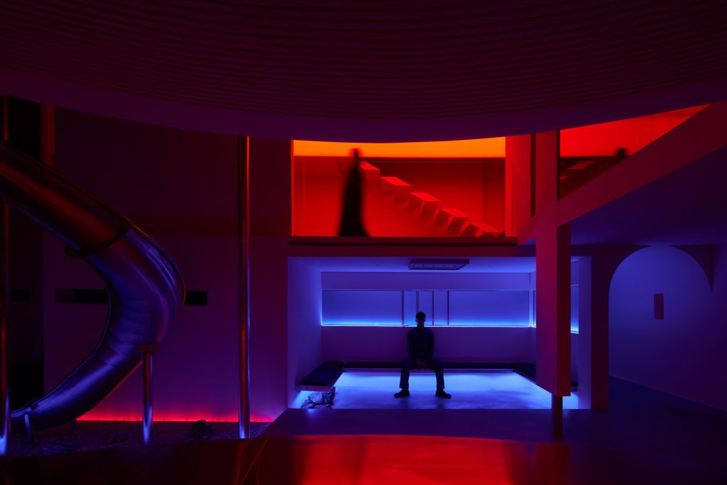
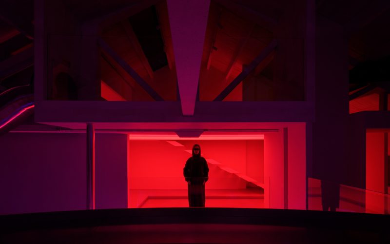
The project does not leverage the single pattern of conventional transformed spaces. Instead, it links diversified and composite commercial chains into the cultural destination where the young gather, and adopt inclusive and innovative design languages to create a brand new socializing scene, with a gradual impact on the character of the whole city. Cafe, bar, photography base, and boutique are interconnected in marketing strategy, together forming a closed, logical offline experience loop. The existing beam structure is retained as much as possible and becomes an integral part of the diversified space, which interprets the structural philosophy of overlapping and staggered beams in an open industrial space.
Creativity:
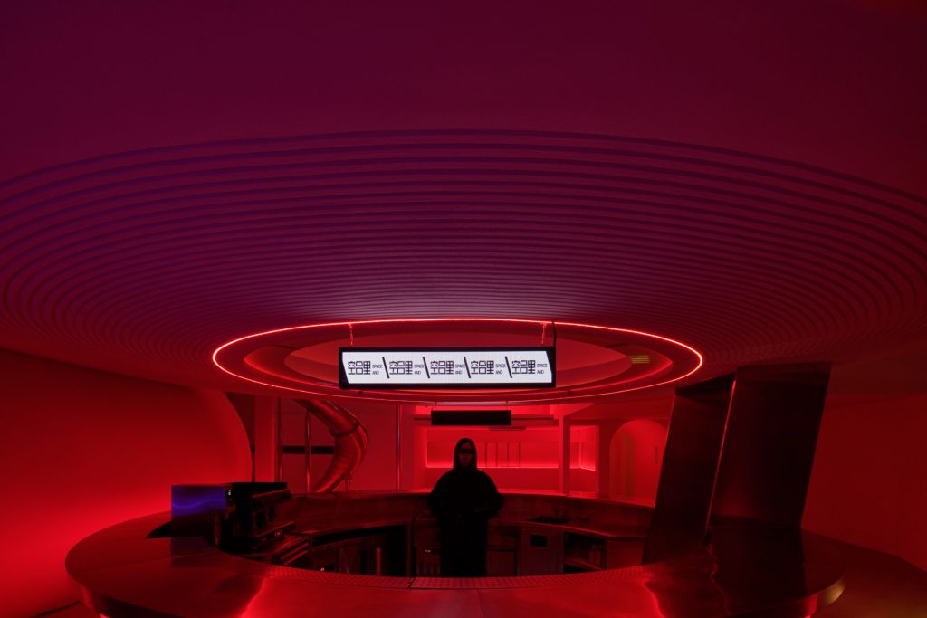
When entering the site, people seem to start an unexpected adventure connecting the past and future. Sightlines freely vary with the circulation route that centers on the round bar counter on the central axis, exploring unconventional sensory dialogue with objects and the space. Within the frame that spans the boundary between inside and outside, each thematic area is interconnected yet independent. The immersive lighting with color gradients and a sense of future technology enhances the theater-style atmosphere characterized by bizarre forms and various hues, while also enriching the layers of staggered scenes. Gray and white textured paints highlight the plain, natural tone of the overall space. Arc expressions, combined with functions, technology, and aesthetics, circulate and extend up to the interior ceiling, enabling people to discover architectural structural beauty in familiar yet novel varying scenes.
Functionality:
Drinking service is offered on 1F, while fashionable boutiques and photography bases are set on 2F and 3F. The separated space featuring a sense of layering is logically consistent with young people’s socializing habits, thus stimulating more behavioral scenarios. In the future, the space will be open and restructured targeting market and consumer group demands, with more fashionable and superior vertical commercial activities constituting the evolving Anti-Mall.
Sustainability:
The project takes advantage of the flexible spatial structure and reduces the architectural volume to pursue sustainability. The overall decorative materials are simple and unified, avoiding environmental damage as well as a waste of resources. Gaining insight into the local features, the design continues the distinctive cultural context of the city. Large glass on the top of the building introduces more natural daylight, hence reducing energy consumption and bringing the building and environment closer. Interior green plants and white walls together create a quiet, sustainable space.
