Around the world by Foster Partners, Roger van per Heide
At first glance, it seems that Apple’s strong retail design has derived from consistent design. But since Steve Jobs opened the first Apple Store in 2001, the brand has changed its store and lighting design concept five times. Thereby change appears as a central factor when a brand grows and expands internationally. For each period Apple developed sophisticated details and has strived for the perfect sky in their store – a smart strategy to enhance naturalness and sustainability.
The first generation of store-in-store concepts started with a grid of square luminous ceiling panels thus introducing the distinctive ceiling appearance for Apple stores. At this stage, the white luminous ceiling panels are reminiscent of a cloudy sky. This design strategy can hardly be interpreted as a visionary for fancy computers, but rather as an expression of retro design, conjuring up memories of the fluorescent lighting when the modern corporate workplace started in America in the 1960s. However, when companies needed to communicate values like sustainability, the lack of daylight turns into a serious problem.
Uniform sky for calm serenity
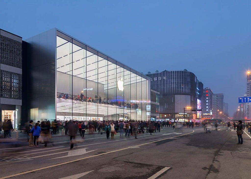
In 2014, and in collaboration with Foster + Partners, Apple introduced a major relaunch of its stores with seamless luminous surfaces covering the complete ceiling. The soft glow induces a calm atmosphere to relax. In order to add subtly focal glow to ambient luminescence, directional spotlights are mounted on slim parallel channels. The first-of-its-kind store opened in Istanbul in combination with the glass lantern for daylight. The Hangzhou store (2015) extends the luminous ceiling concept over two stories for a striking shop window experience.
A key source of inspiration during the concept phase for the luminous ceiling was the Design Dome in the General Motors Technical Center, designed by Eero Saarinen in collaboration with lighting designer Richard Kelly. Corporate buildings designed by Skidmore Owings & Merrill, such as the Manufacturers Hanover Trust in New York (1954) or the Union Carbide Corporation Headquarters in New York (1960), are among the early examples of extensive luminous ceilings for branding. However, the increasing diffuse light let already to a distinct criticism in the 1970s, as the American architect Der Scott pointed out, “Among all ceiling lighting systems available today, the luminous ceiling is the highlight of visual monotony”.
